As the smartphone has risen to the #1 device for making online purchases, mCommerce (or, mobile commerce) has made its way into the public vernacular.
Mobile devices account for nearly 60% of all web traffic and well over 70% of all eCommerce sales. It’s no wonder that Google now gives preference to sites that are optimized for mobile use.
With all of this in mind, it’s more important than ever for online businesses to have a mobile friendly website.
In 2018, Google first announced the rollout of mobile-first indexing, but a lot has happened since then. Mobile shopping has continued to dominate the eCommerce landscape, and the trend is upward.
“Mobile-first indexing is now the standard. That means algorithms use the mobile-rendered version of a page instead of the desktop version.” –Search Engine Journal
What does this mean for membership sites in particular? Well, as eCommerce entities, the same rules apply to membership sites.
However, there’s an additional element to consider: Members not only want to be able to purchase their memberships on their mobile devices; They also want to regularly use their memberships in their day-to-day lives.
Quite simply, this means that memberships offering an enjoyable mobile experience will end up taking the cake.
In this post, we’ll cover more about what mobile friendly means, why it’s important, and how to create a mobile friendly website for your membership business.

What Is a Mobile Friendly Site
Mobile friendly can mean a lot of different things, but the primary factor is the ease of use on a mobile device, generally speaking. PCMag defines mobile friendly as “a website that is easy to use on a mobile device, especially the small screens of smartphones.”
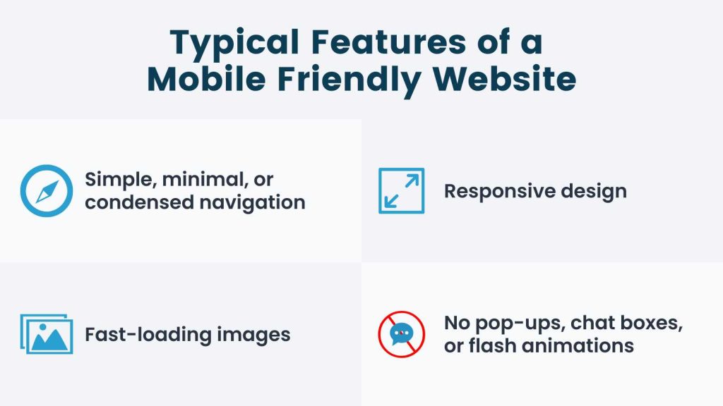
Here are some typical features of a mobile-friendly website:
- Simple, minimal, and/or condensed navigation with quick and easy access to the most important elements of your membership (like the login link, signup link, and content library, for example). This makes the most of the smaller visual landscape of mobile devices and enables mobile users to easily find what they’re looking for.
- Responsive design. Sites that incorporate responsive design automatically adjust the layout and content to the device being used, so that the user doesn’t have to manually scroll and zoom in order to see, read, or interact with what’s on the page.
- Fast-loading images. Compressed images with smaller file sizes load faster in any case, but this is especially true for mobile devices.
- No pop-ups, chat boxes, or flash animations. Anything that slows load time or complicates the mobile user experience is generally omitted.
A mobile friendly membership site may also feature:
- A simplified member dashboard. For example, a condensed view of membership status, features, and account information.
- Easy content navigation that allows members to use the membership seamlessly on mobile devices.
- Personalized user experiences for non-members and logged in members, so that you aren’t showing redundant sales copy or pricing to people who are already subscribed.
- A responsive pricing page, so your pricing is always displayed properly on different devices, even if the rest of your site is not 100% responsive.
- A simple checkout using payment request buttons like ApplePay and GooglePay.
- Easy access to socials and communication apps like Facebook, Instagram, Twitter, Discord, and Slack. You could display minimal social icons and links that enable site visitors to easily contact your team via Messenger, WhatsApp, email, or text (for example).
- Consider a mobile app, PWA, or add a prominent link to bookmark your site. A PWA is a mobile app built from your website. You can use a tool like Apppresser to generate a mobile app from your existing WordPress site without any mobile development skills needed. Or, create a prominent link that users can use to bookmark your site on iOS devices or add the page to their mobile device’s home screen on Android.
Why Mobile Friendly is Important
User Experience is Everything
A good user experience is at the heart of any successful membership site. In fact, how much members enjoy their memberships on a weekly, or even daily basis is what keeps them coming back and paying every month.
With a world that’s constantly on the go, this often comes down to how well members can consume content on their mobile devices.
Mobile Use Accounts for the Majority of Internet Traffic
Smartphones and tablets account for nearly 60% of all internet traffic—that’s more than half of all internet activity! This figure is likely even higher for premium content membership site, where visits are more frequent and members are more involved in your community.
Google Prefers Mobile Friendly Websites
After announcing the rollout of mobile-first indexing in 2018, Google began prioritizing mobile-friendly websites in its search engine results pages (SERPs). This meant that any websites that were not mobile friendly were effectively penalized for it.
A lot of time has passed since this announcement, during which mobile internet use has only increased. It follows that the importance of implementing a mobile-friendly website has increased proportionately.
“To further emphasize the importance Google places on responsive mobile design, in 2020, the search engine adopted a new form of indexing that ditches the desktop crawler.” –Search Engine Journal
A Mobile-Friendly Website Beats the Competition
While mobile-friendly websites are increasingly in-demand, many businesses are still behind the curve. Use this to your advantage! By making sure your membership site is mobile friendly, you’ll give yourself a good shot at coming out ahead of the competition.
You can even use this as a strategic move if you have a single prominent competitor that does not have a mobile-optimized site.
How to Know If Your Site is Already Mobile Friendly
1. Find out what devices your members are using. Check your analytics platform to see the percentage of your users that are accessing your site on mobile devices. While this is not necessarily an indicator of how much focus you should put on mobile optimization, it will show you the device types that your members are already using on your website—and can inform your content and design decisions.
If you’re using Google’s Universal Analytics (UA), navigate to Audience > Mobile to see a breakdown of traffic by Device Category.
In the new Google Analytics 4 platform (GA4), this data is included in the Reports > User > Tech Overview screen. You can click through to the “Device Category” report for a more detailed breakdown.
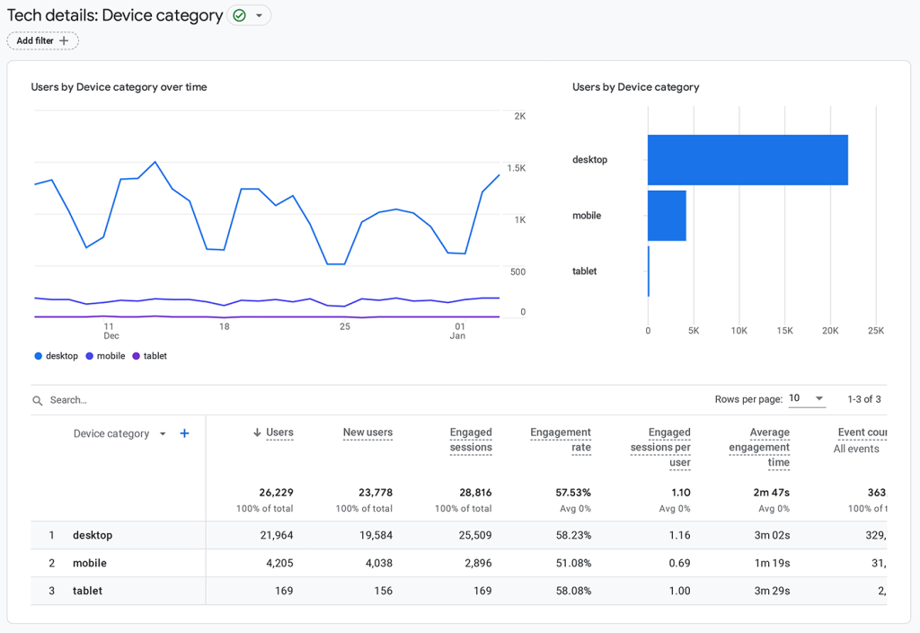
If you aren’t using Google Analytics, these same reports are often available with other analytics tools like Fathom or Jetpack Analytics.
2. Test your membership site for mobile friendliness. You can use tools like Google’s Mobile Friendly Test and GTMetrix to analyze mobile performance factors across different devices, and Speed Test to check load times.
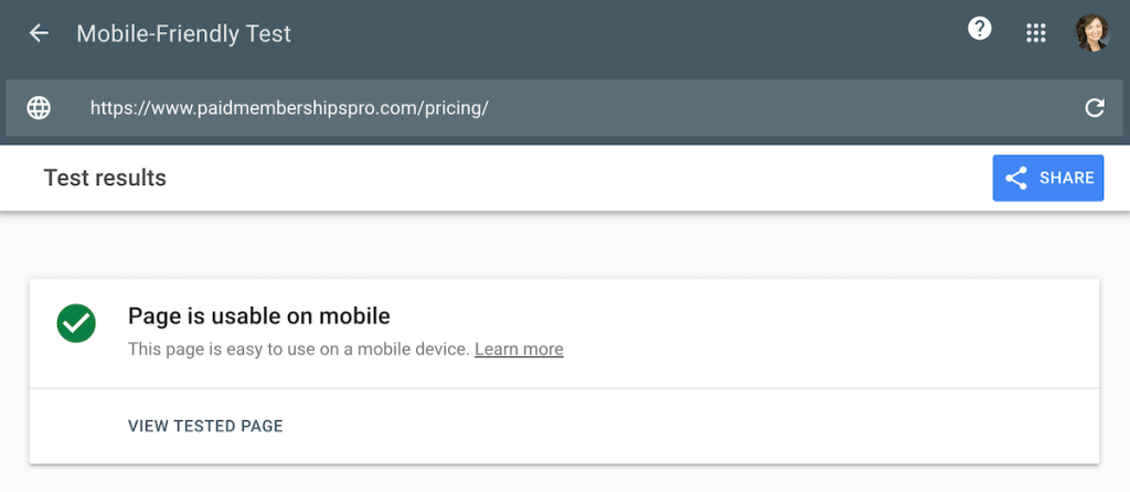
Try running a few URLs through the test, including your homepage, blog page, and contact page. Test pages that are already pulling in higher amounts of search traffic: These are the pages you do not want to see negatively impacted by the mobile-friendly ranking signal.
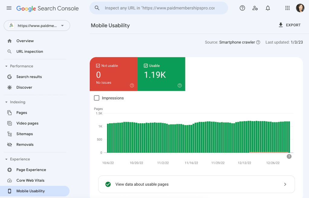
You can also use Google’s Mobile Usability Report to get a complete list of any pages on your site that have usability problems when viewed on mobile devices.
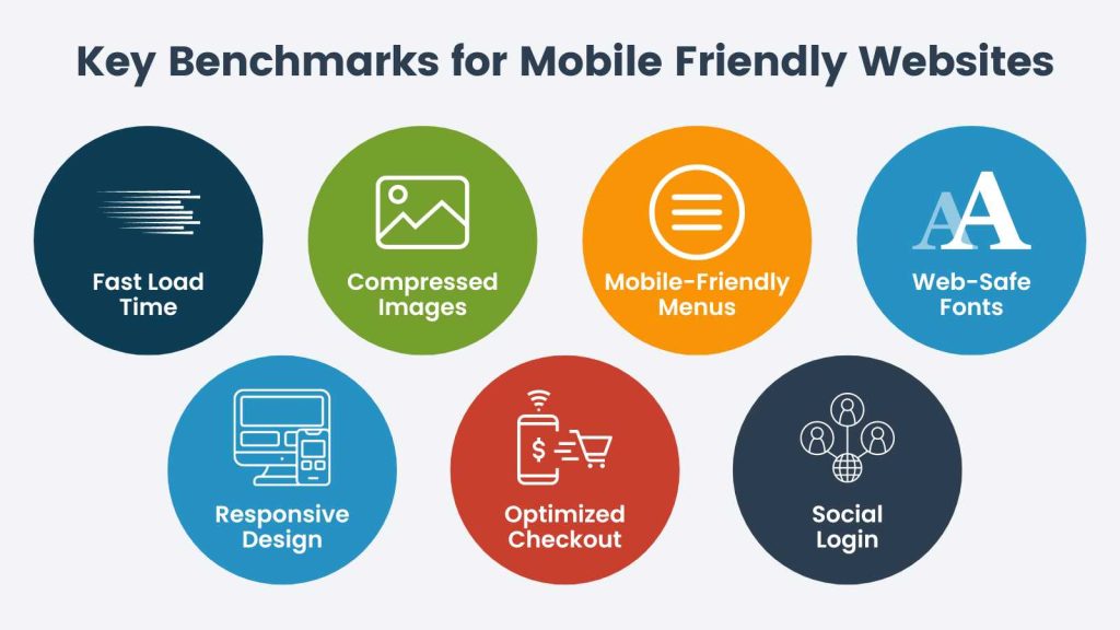
Now, let’s take a look at some key benchmarks that you can use to assess and optimize your membership site for mobile use.
Key Benchmarks for Mobile Friendly Websites
Fast Load Time
While load time is an important performance indicator for websites in general, this can be especially true for mobile devices. This is because these devices vary in their technical capabilities, and often rely on mobile data networks that may or may not be as robust as home internet connections.
Improving load time can be done by optimizing images for mobile devices, using responsive design, taking a minimalistic approach to navigation and other site elements, and using caching.
Caching reduces the amount of data that must be transferred from the server to the mobile device. In our documentation for advanced developers, we talk more about some special considerations for caching, including membership site-specific recommendations.
Mobile-Optimized Images
Mobile devices have smaller screens, which means that larger image resolutions will take longer to load or make page content harder to read—especially if responsive design is not used).
To optimize your images for mobile devices:
- Resize them for mobile display. For reference, smartphones outweigh tablets when it comes to mobile devices used. It’s common to see images no larger than 600 pixels wide on mobile-friendly websites, especially when it comes to blogs.
- Use the best image file types for web, like WebP (now supported in WordPress 5.8), JPEG or JPG instead of PNG.
- Compress them using tools that manage file compression directly within WordPress like Smush, or JetpPack. Or, pre-compress your images using a free web app like TinyPNG.
- Find a balance between quality and small file size—ideally under 100 KB per image. However, if your content is particularly visual, you might choose a higher image quality than a site centered around written content might. If you use WordPress, several sizes of each image you upload to the media library will be automatically created.
- Implement lazy loading. WordPress now does this by default, but you can also use the above mentioned tools like Smush or JetPack for this purpose.
Mobile-Friendly Menus
Navigation is one of the most important factors when it comes to creating a mobile-friendly website. How people use your site can be vastly different on a mobile device vs. a desktop or laptop computer.
A mobile-friendly menu should be:
- Easy to see / locate
- Hidden until tapped to preserve screen real estate
- Fixed (or “sticky”), since users will likely have to scroll more than they would on your desktop site
- Condensed to only contain the most essential menu elements
Standard / Universal Web-Safe Fonts
This applies to web design in general, but using standard or universal web-safe fonts is a great choice for keeping your membership site accessible and displaying properly for as many users as possible.
“Web-safe fonts are fonts that can adapt to any browser on any device. By using these types of fonts, web designers and developers ensure that the intended font will always display properly on a web page, even if these fonts aren’t installed on the user’s computer.” –HubSpot
Fonts make a big difference in the user experience, and this is even more true for mobile devices, which have smaller screens.
Some examples of commonly-used universal fonts include Helvetica and Arial, but Open Sans is a popular contemporary choice, as it was optimized for mobile interfaces.
Remember that different mobile devices (and users) may use enlarged font sizes for better readability. You can test how text is displayed on your website by trying out the enlarged font options on your mobile device to make sure the design and reliability holds up.
Responsive Design
One of the major go-to mobile-friendly practices is something called responsive design. This design strategy optimizes the layout and content so that it’s displayed correctly, regardless of what device is being used.
“Responsive mobile design is a core component of a good user experience. That’s not an opinion, either. It’s baked right into Google’s page experience algorithm update, which they also rolled out in 2020.” –Search Engine Journal
If you want to implement responsive design on your membership site, there are many responsive themes available for all kinds of different platforms, especially WordPress. Or, you could hire a custom developer.
You can also use Device Mode in the Chrome developer tools panel to simulate a mobile device viewport and test how your site looks and functions on a mobile device. You can use the predefined device profiles or create your own custom profile and test your site in various mobile device configurations.
A Mobile-Friendly Checkout Experience
In our post Does Your Membership Registration Page Maximize Conversions? we talk about how complexity kills conversions. Well, this is even more true when it comes to mobile devices!
Let’s face it: Often, checkout experiences are a bit easier on desktop and laptop computers, especially if customers have to painstakingly enter card details and billing addresses. This can be annoying, cumbersome, and even push some customers to abandon their carts!
However, there are a few best practices you can incorporate to make your checkout experience mobile friendly:
- Reduce any distractions. The checkout is the key moment where you’re about to convert a sale, so leave out any extra images, information, or other distractions that could keep people from completing the process.
- Require as little information as possible. With memberships, you’ll need to have some sort of registration process, but try to keep the information you collect down to the bare minimum you actually need.
- Don’t display a coupon field. This can make new members second-guess whether or not they have a coupon lying around somewhere, and can stall the signup process.
- Make it extra clear what the customer is buying. Don’t leave anyone guessing and you’ll save yourself some headaches and refunds down the line. The product name, image, price, and any other essential information (such as subscription intervals) should be up front and center—and nothing else.
- Don’t link to any external pages. This can take people off of your checkout page, and with the nature of tab-based browsing on mobile, it’s very possible they might not return.
- Offer payment request buttons like ApplePay and Google Pay. While PayPal and Stripe are also go-to options, these mobile payment methods reduce friction for the user, simplifying the purchase process and decreasing the likelihood of cart abandonment. You could also add a card scanning functionality to make it easier for customers to enter their card details.
- Optimize your forms for mobile. Reduce your forms to a single column and reduce the number of fields as much as possible. Enable field auto-filling and auto-correct to make it much quicker and easier for people to fill it out on their smartphones or tablets. Check out our post Membership Checkout Optimization: 3 Ways to Reduce Form Fields at Checkout for more guidance.
Social Login
Social login allows the user to log into your membership site using their social media account. Since many people use social media apps on their mobile devices, it’s always helpful to add this feature to your membership site if you want to optimize the mobile experience.
Facebook and Google are, by far, the most popular social login options, according to Statista.
Other Mobile-Friendly Tips to Consider
- Reduce obstacles for your site visitors by giving them easy access to your site search function.
- Make your content extra easy to read by increasing white space.
- Use large and clearly identifiable buttons for your calls to action (CTAs).
- Keep the touch-based experience in mind, with tap-friendly elements and a layout adjusted for touch-based navigation.
- Consider adding progress bars to your checkout page to let customers know how far along they are in the process. You can also add progress bars to your membership content, such as blog posts or course pages.
The #1 Mobile-Friendly Principle: Keep it Simple
Above all, to make your membership site more mobile friendly, keep it simple! From your navigation to your forms, checkout, and content, you want your site to be as quick and easy to use as possible.
Unnecessary carousels? Boot ‘em. Big, slow-loading images. Delete! Media players? Try embedding your YouTube videos and podcasts instead.
If your membership site is already loaded with bells and whistles, now might be the time to simplify. Even desktop sites are slowed down by too many elements.
Minimal is the name of the game.
Conclusion
While mobile friendliness is very important, search intent and the needs of your target audience are still the most important factors you want to consider in your content, design, and marketing decisions.
There may be common elements of mobile-friendly websites that don’t apply to your members and site visitors, such as super lightweight and highly-compressed images. If your site is based on visual content like photos and graphics, you may prioritize other mobile optimization strategies over fast-loading images. Most likely: You’ll find the right balance that works for you.
If you’d like more information on creating a stellar user experience with an optimized membership site, check out some of our other posts:
- Track Membership Signups and Stats on a Mobile Device
- Does Your Membership Registration Page Maximize Conversions?
- How to Create More Click-Worthy CTAs
Looking for a WordPress membership plugin that gives you a complete set of tools for creating and managing a membership site? Learn more about why you should use Paid Memberships Pro.
Free Download: The AI-Powered Membership Site Blueprint
Download the free guide: Learn how to plan, build, and grow a membership site using AI as your strategic partner: from buyer persona to launch and beyond.