Getting a visitor to your membership registration page can feel a lot like running a race. You’re so close to the finish line. Then, out of nowhere, another runner blows past you to claim first place.
It doesn’t matter how well you run the rest of the race if you can’t cross the finish line first.
The same is true with your membership website. You can write the most compelling homepage, but if visitors bounce when they get to your registration page, you’ll still lose a sale.
To close the deal, you must ensure that your membership registration page maximizes conversions. This post covers what to include on your registration page, potential pitfalls to avoid, as well as some tips for optimizing conversions.
What Makes a Great Membership Registration Page?
As the developers of a WordPress membership plugin, we’ve dealt with our fair share of registration pages. The best ones we’ve seen all have a few key things in common. Elements of a dynamic membership registration page include:
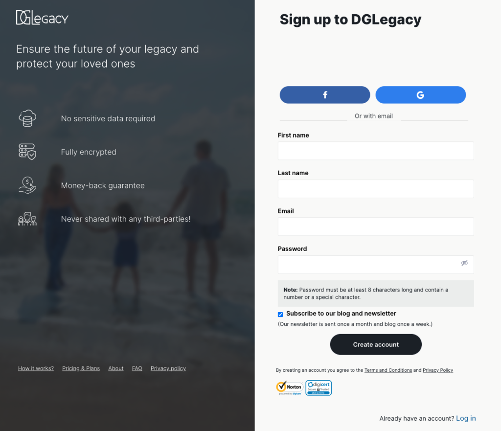
Clear Messaging.
Get to the point and convince people why they should sign up. Your messaging should be easy to understand and match the rest of your site.


Demonstrated Value.
Make it clear what the member gets by signing up. Explain your core value proposition for members.
Compelling Calls-to-Action.
Drive actions with your writing. If site visitors leave, they likely won’t come back and act later. Create a sense of urgency, so that people are compelled to complete a purchase.

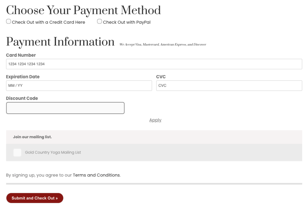
Diverse Payment Options.
Don’t let a lack of payment options keep you from converting a visitor into a paying member. Offer multiple ways to pay to maximize your conversions.
Cohesive Visual Appeal.
Your registration page should look professional and visually appealing, just like your membership site. With the existence of fraud and questionable online business practices, people are more willing to trust websites that “look the part.”
Potential Pitfalls to Avoid
Now that we know what works, let’s talk about what can go wrong. Common causes of poorly converting membership registration pages include an overcomplicated process, confusing tiers, and a lack of mobile optimization.
Overcomplicated Process
Complexity kills conversions. The longer your sign-up process is, the more chances you give a prospective member to change their mind.
The same concept applies to conversion rate optimization for eCommerce or lead generation forms. People are impatient—they don’t want to wait to complete lengthy forms.
It’s like going to the grocery store. Customers never intentionally pick the longest checkout line. In fact, if lines are too long, they may even walk away without buying anything.
Similarly, members may leave your site without finishing their purchase if your sign-up page and registration forms are overly complicated.
Make sure your registration form requires only the most necessary information.
Confusing Tiers
Membership tiers are a great way to increase your revenue, but they can have the opposite effect when done incorrectly. For example, if you offer too many membership tiers, subscribers may struggle to distinguish between them.
In fact, some people shut down in a type of decision paralysis when faced with too many choices.
Keep your membership tiers simple and easy to understand. Check out our post on using membership tiers to maximize revenue for more information.
Ideally, tiers should be easily distinguishable from one another. They should also be priced to meet different market segments and budgets.
Lack of Mobile Optimization
Nowadays, most web traffic is mobile. If your checkout page isn’t mobile-optimized, it likely won’t convert well.
Mobile optimization includes layout and speed. Pages should load fast on different devices and the layout should fit a mobile screen.
In particular, form fields should go full width or split 50/50. Anything smaller than that makes the field difficult for site visitors to read and fill out.
4 Tips to Maximize Conversions on Membership Registration Pages
That’s it for the dos and don’ts; Now for the advanced strategies. Deploy these tips if you want to supercharge your membership registration page conversion rate.
1. Offer a Free Trial
Sometimes members need a low-threat on-ramp to encourage them to make that final purchase. Free trials are a great example of this, as they allow people to experience the value of your membership firsthand.
Free trials also allow you to capture people’s contact information—and it’s much easier to convert someone if you know who they are. For example, you can use follow-up marketing and onboarding to upsell the free trial user to a paid subscription.
Money-back guarantees are another way to overcome buyer hesitancy by reducing any risk. This gives buyers the extra assurance they need to make a purchase.
2. Use Social Proof
What do you do before you click buy on Amazon? You look at the reviews. The reviews for your membership site should be front and center as well.
Social proof, like reviews and customer testimonials, can help leery visitors decide to register. Choose reviews or testimonials that highlight your value proposition if you want to make the biggest impact.
People ultimately want to know that their purchase is worth the money. Let your top fans help you by encouraging them to tell others why they enjoy your membership program.
3. Simplify Getting In Touch
Adding a live chat or contact button to your forms is another great way to increase conversions. If people have a question, it’s best for you to answer while they’re actively considering joining.
If you can answer quickly enough, you can prevent them from leaving without completing the process.
4. Consider a Countdown Timer
Nothing creates a sense of urgency like a counter going down. If you’re running a promotion, consider adding a countdown timer to show when the discounts will expire. You could also count down to the release of a new product or content.

This strategy might not work for everyone, but when done well, it can entice more people to finish the sign-up process.
How Does Your Membership Registration Page Stack Up?
Membership registration is vital for the success of your business. You need that page to convert visitors to paying members if you want to grow a thriving membership site.
To increase your chances of success, focus on creating a well-designed, simple, and functional registration page. Avoid confusing membership tiers and complicated forms as well.
Lastly, add social proof and create an easy, low-risk on-ramp for site visitors, and your conversion rate should soar.
If you’re looking for the right plugin to build your registration page, download Paid Membership Pro today. With our free plan, you can build a rockstar registration page, or upgrade to unlock all kinds of additional features to help you customize your membership site.
More Content About Membership Site Data and Analytics
- Membership Site Analytics: How to Set Up GA4 and GTM with Custom Dimensions
- Ecommerce Analytics: Send Events to Google Tag Manager and Google Analytics 4 (GA4)
- How to Set Up Google Analytics GA4 Conversion Events for Membership Sites
- How to Reliably Track Ad Campaign Conversions with Privacy-First Affiliate Tracking
- Extraordinary Strategies to Manage Membership Engagement
- Does Your Membership Registration Page Maximize Conversions?
- Top Membership Site KPIs to Measure
Free Download: The AI-Powered Membership Site Blueprint
Download the free guide: Learn how to plan, build, and grow a membership site using AI as your strategic partner: from buyer persona to launch and beyond.