The Advanced Levels Page Add On includes six layouts for your membership levels. Pick the one that fits how many levels you offer and how you want visitors to compare them. The examples below were captured with our Memberlite theme.
Div Layout
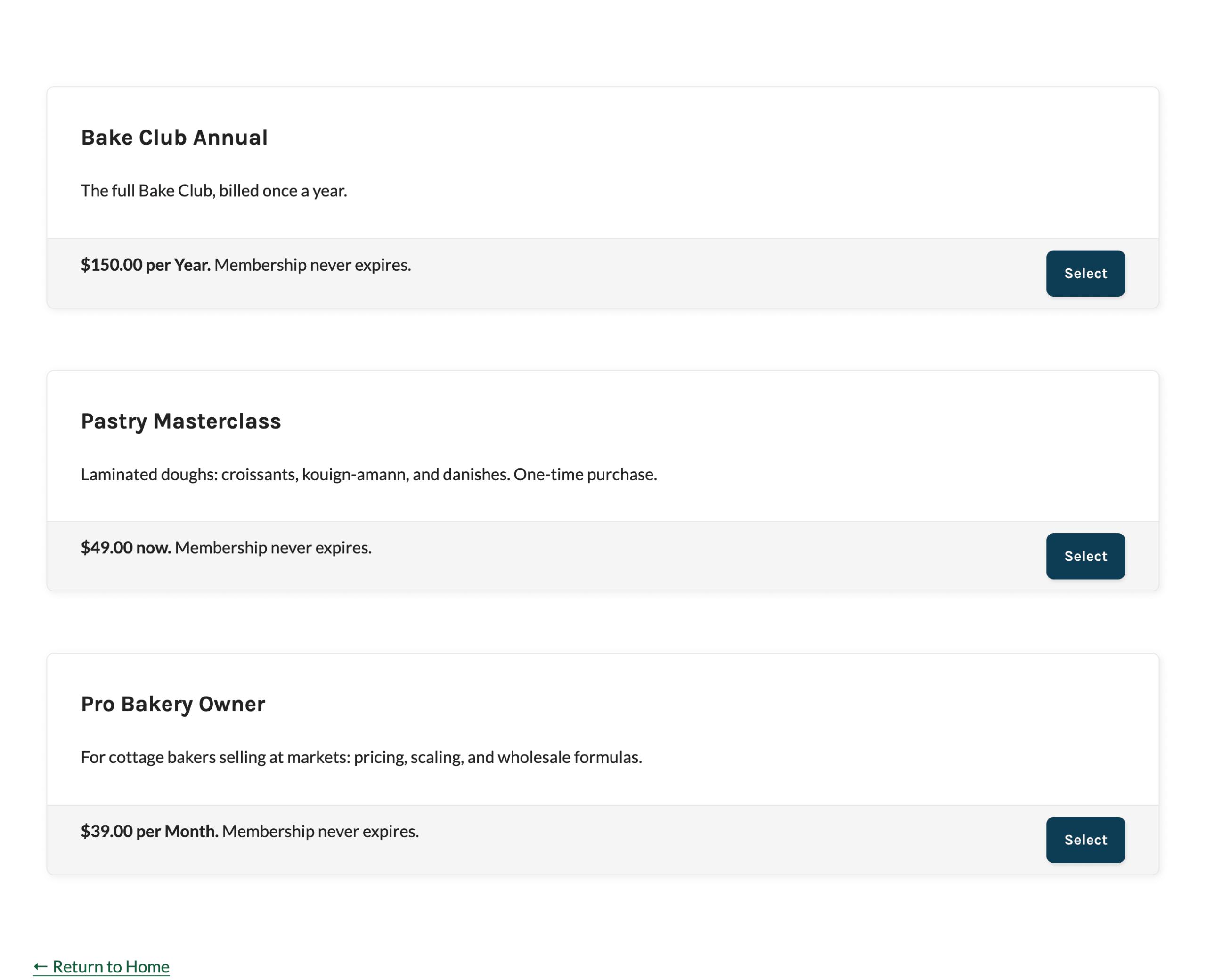
The default layout. Each level is a full-width card stacked on top of the next. The card shows the level name and description, then a footer row with the price, expiration, and checkout button. Use this layout when you have a few levels with longer descriptions.
Block setting: Layout > Div. Shortcode attribute: layout="div".
Column Layouts
The column layouts place your levels side by side. On smaller screens, the columns wrap so each card stays readable. On screens 768 pixels wide and below, every column layout stacks into a single column.
2 Columns
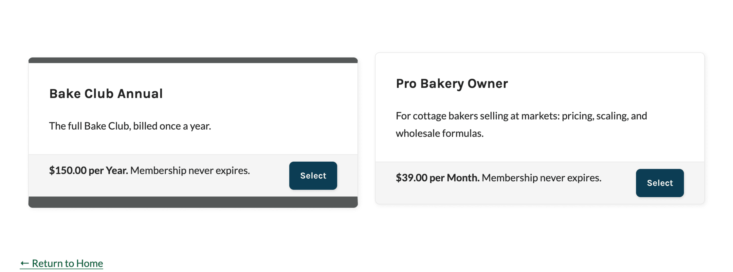
Shows two levels per row using the same card content as the Div layout: the name and description, then a footer with the price, expiration, and button.
Block setting: Layout > 2 Columns. Shortcode attribute: layout="2col".
3 Columns
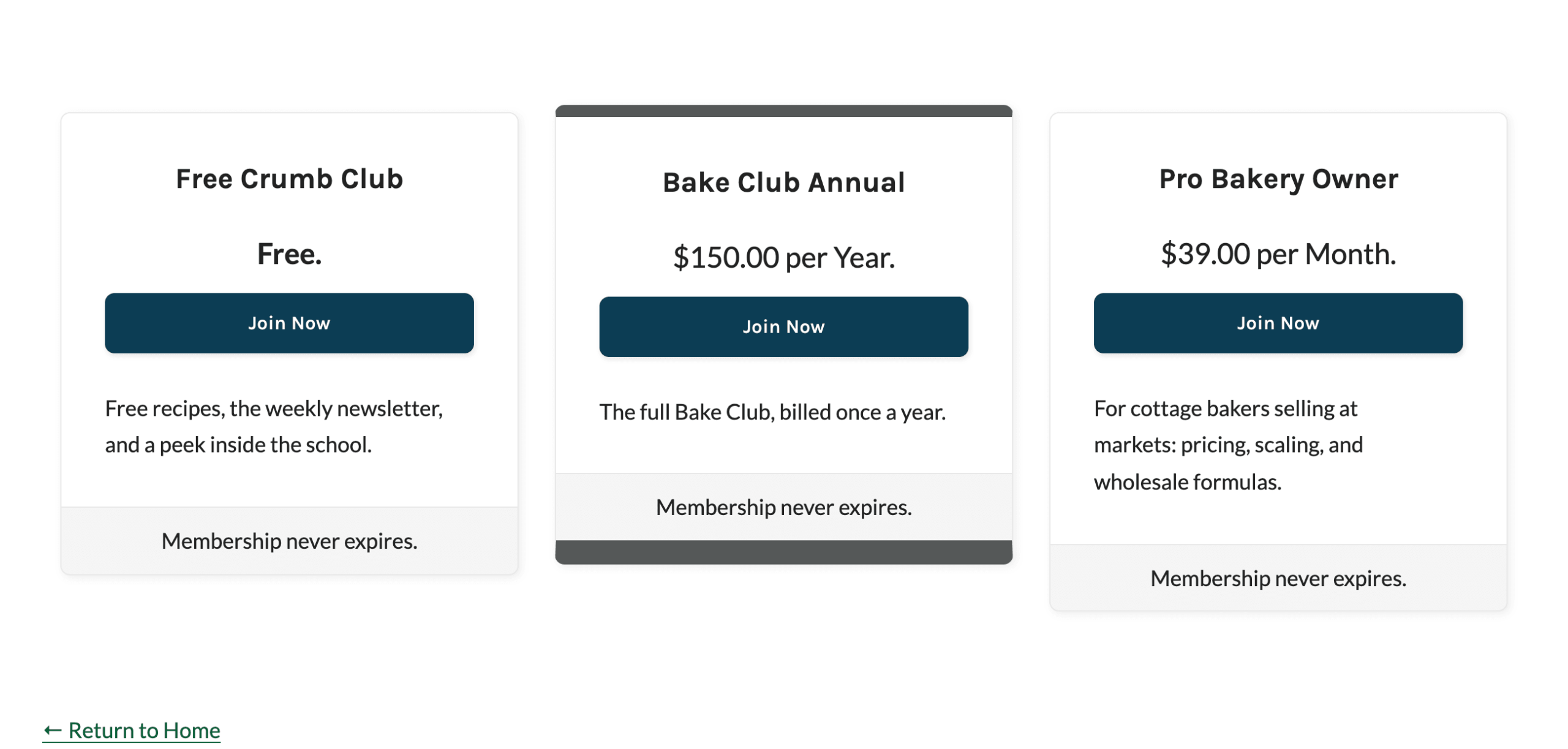
Shows three levels per row in centered cards. Each card leads with the price and checkout button, followed by the description, with the expiration in the card footer. This is a common layout for a pricing page with three plans. Between 769 and 959 pixels wide, the cards wrap to two per row.
Block setting: Layout > 3 Columns. Shortcode attribute: layout="3col".
4 Columns
Shows four levels per row using the same centered card design as 3 Columns. The cards wrap to three per row between 960 and 1160 pixels wide, and two per row between 769 and 959 pixels wide.
Block setting: Layout > 4 Columns. Shortcode attribute: layout="4col".
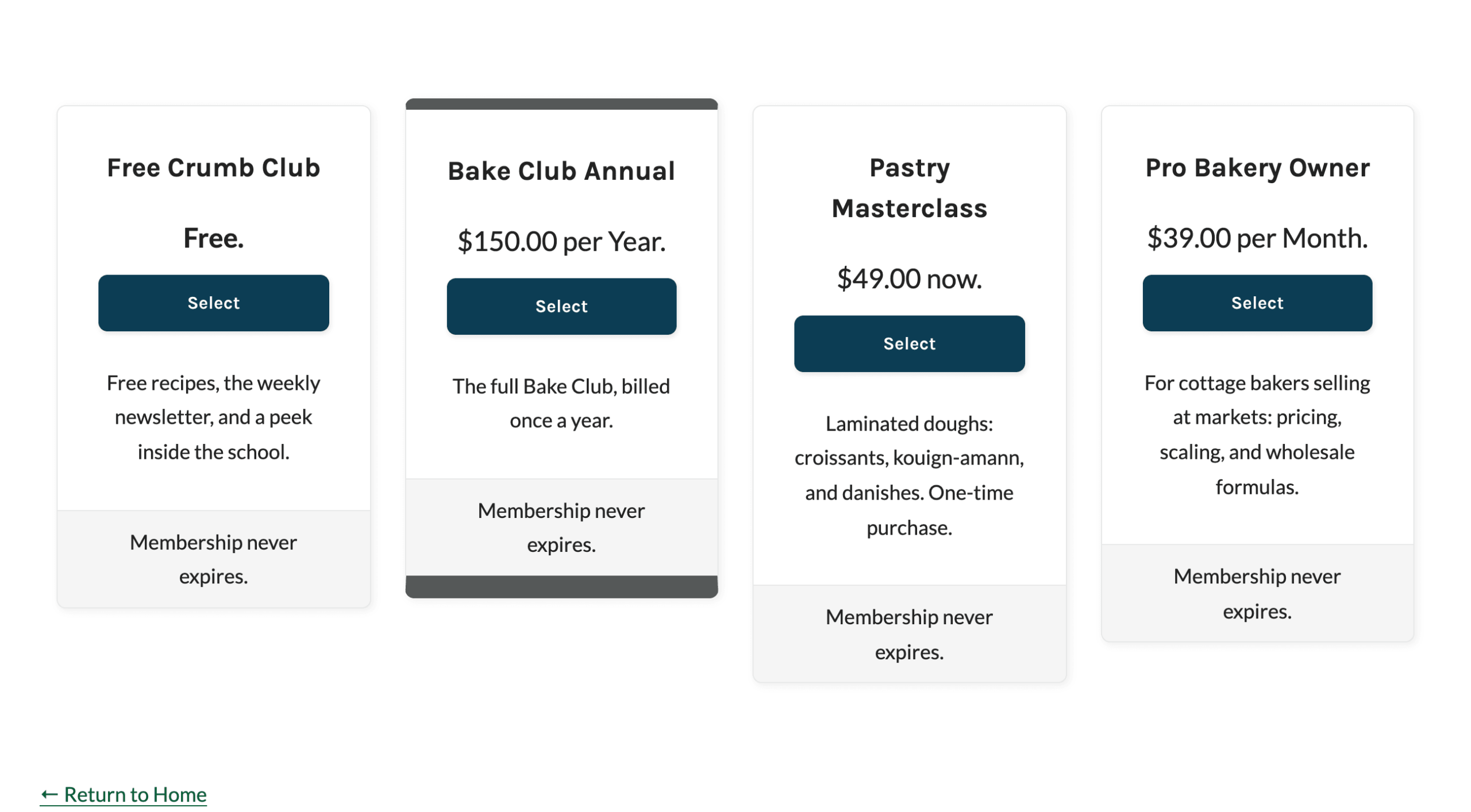
Table Layout
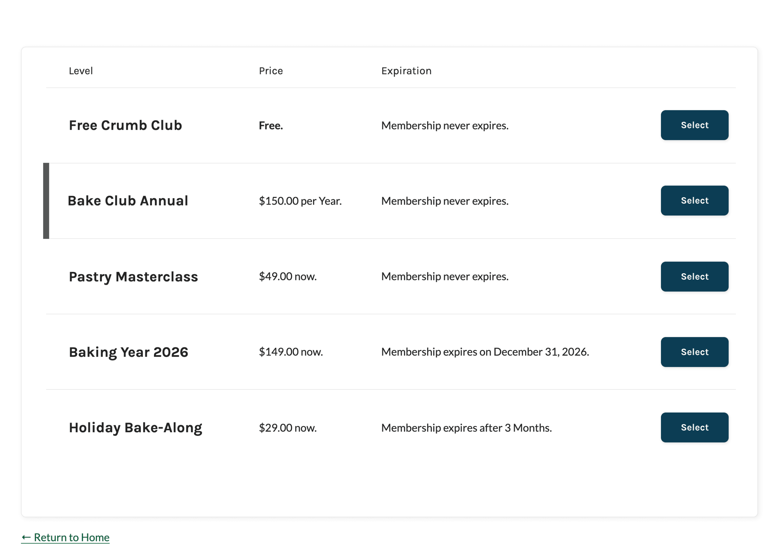
Shows your levels as rows in a table with columns for the level, price, and expiration, plus a column for the checkout button. The level description appears below the level name when Level Description is on. The Price column is removed when the price is hidden, and the Expiration column is removed when Level Expiration is off.
Developers can add their own columns to this layout with the table layout hooks.
Block setting: Layout > Table. Shortcode attribute: layout="table".
Compare Table Layout
Shows each level as a column so visitors can compare features side by side. The top of the table shows each level’s name, price, description, expiration, and checkout button. Below that, you add your own comparison rows with a checkmark, a dash, or custom text for each level. The checkout buttons and expiration repeat at the bottom of the table. Learn how to set up the rows in Build a Membership Comparison Table.
Block setting: Layout > Compare Table. Shortcode attribute: layout="compare_table".
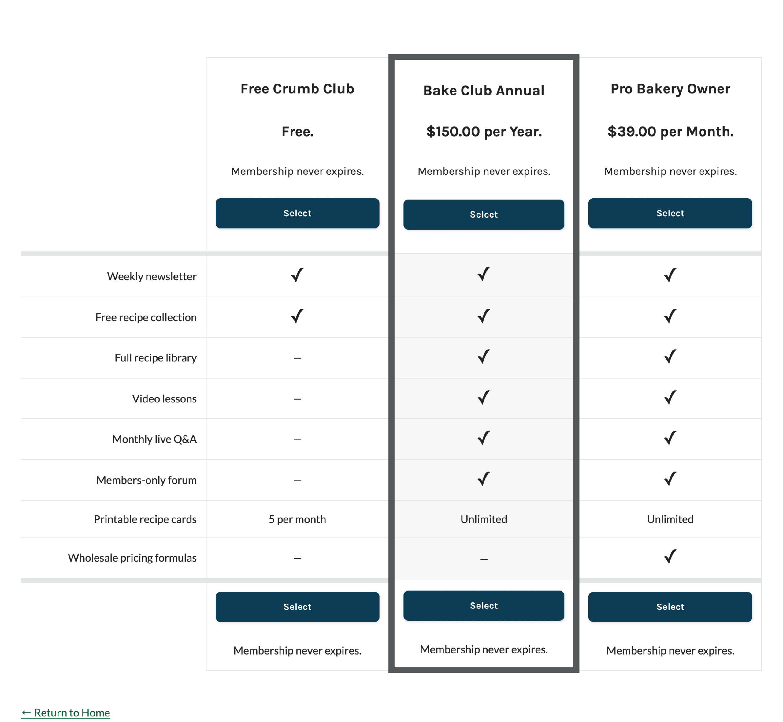
On screens 767 pixels wide and below, the table is replaced with stacked cards. Each card lists the features included with that level. See how the comparison table displays on small screens.
Highlight a Level
Use the Highlight block setting or the highlight shortcode attribute to feature one level, such as the plan you want most members to choose. Enter a single level ID. The Add On adds the pmpro_level-highlight CSS class to that level in every layout.
The Add On does not include a highlight style of its own. Our Memberlite theme styles this class with a dark border, as shown in the screenshots on this page. For other themes, add custom CSS that targets the class. For example, this CSS adds a border to the highlighted card in the Div and column layouts:
#pmpro_levels .pmpro_level-highlight .pmpro_card {
	border: 3px solid #2c3e50;
}
Price Display Options
The Price block setting and the price shortcode attribute control how each level’s cost appears in any layout.
- Short: The default. Shows a condensed price, such as “$150.00 per Year.” or “$49.00 now.” Free levels show “Free.”
- Full: Shows the full price sentence used at checkout, such as “The price for membership is $150.00 per Year.”
- Hide: Hides the price. In the Table layout, the Price column is removed.
Get Support From Our Team of Experts
Have a question about how to use this feature? Our Support Page outlines three ways to get support.
Our Max plans include hands-on help customizing your membership site and implementing new features. Upgrade to PMPro Max now »
Last updated on November 9, 2026