Outputs a link formatted as a button.
Button Examples
Success Button Alert Button Error Button Info Button Link Button
Default Button Primary Button Secondary Button Action Button
Shortcode Attributes
class: An additional CSS class name to add to the button (optional).href: The URL the button links to; can be relative to site domain or external domain (required).icon: Include a Font Awesome icon before the button text (optional; options: any icon name as specified here).icon_position: Control the position of the icon related to button text; accepts: “before” or “after” (optional; default: before).style: The button appearance; accepts “default”, “primary”, “secondary”, “action”, “success”, “alert”, “error”, “info”, “link” (optional; default: “default”).text: The text to display for the link/button (required).target: Specifies where to open the linked document; options: “self”, “blank”, “parent”, “top” (optional; default: “self”).
Shortcode Example
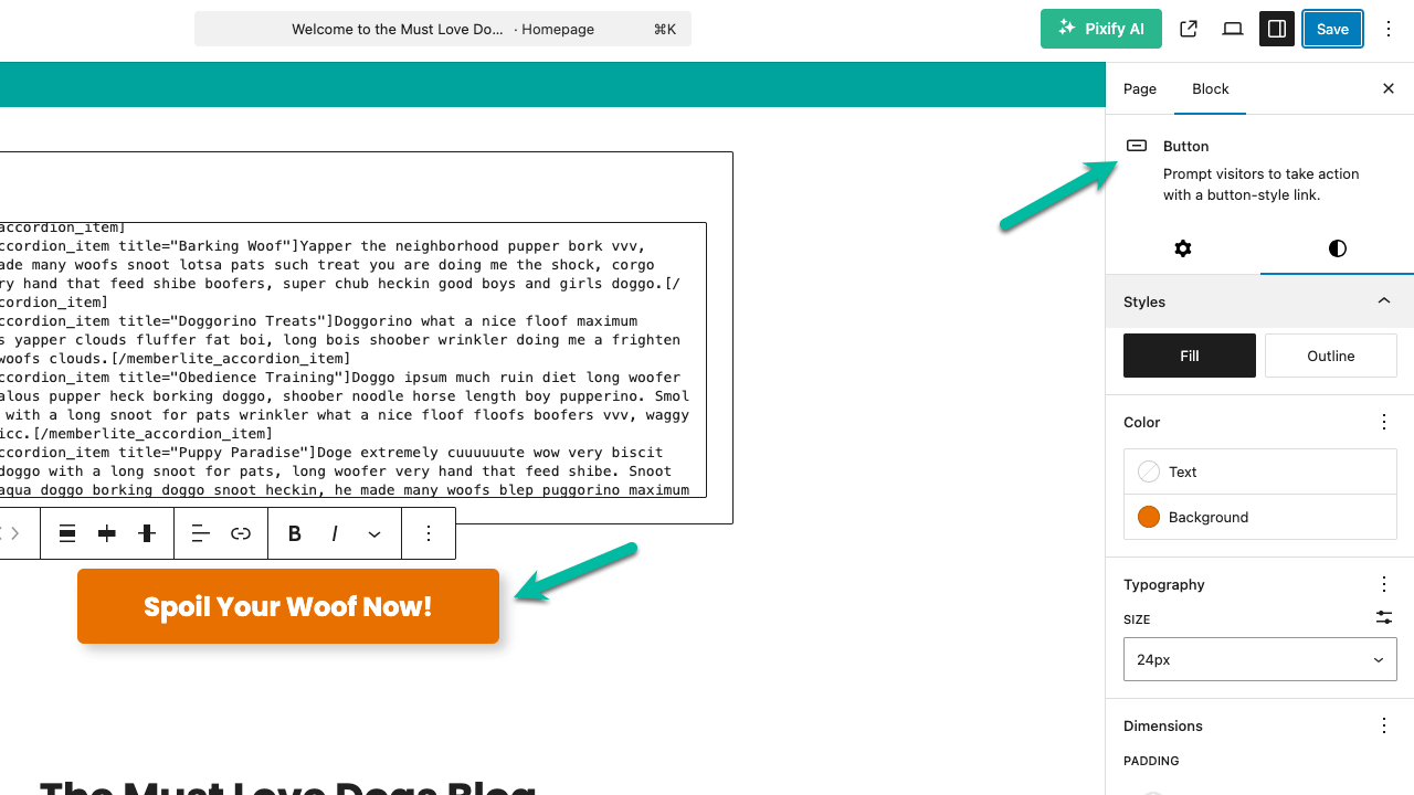
Using the WordPress Block Editor Button Instead
If you’re building pages using the core WordPress Block Editor (Gutenberg), you can use the native Button block to create buttons instead of relying on shortcodes.
When to Use the Button Block
Use the Button block if you:
- Prefer a visual, drag-and-drop editing experience.
- Want to reduce reliance on shortcodes for basic elements.
- Are using a theme that supports block styling (like Memberlite).
How to Add a Button Block
- In the WordPress Block Editor, click the + icon.
- Search for and add the Button block.
- Enter your button text.
- Use the right sidebar to:
- Set the link URL.
- Choose the style (e.g. fill or outline).
- Select a color (matching the style like “success”, “alert”, etc.).
- Optionally set the link to open in a new tab.
Adding Icons to the Button Text
You can insert an icon before or after your button text by using the Memberlite Font Awesome Icon shortcode directly in the button label.
Get Support From Our Team of Experts
Have a question about how to use this feature? Our Support Page outlines three ways to get support.
Our Max plans include hands-on help customizing your membership site and implementing new features. Upgrade to PMPro Max now »
Last updated on April 1, 2026
Was this article helpful?
YesNo