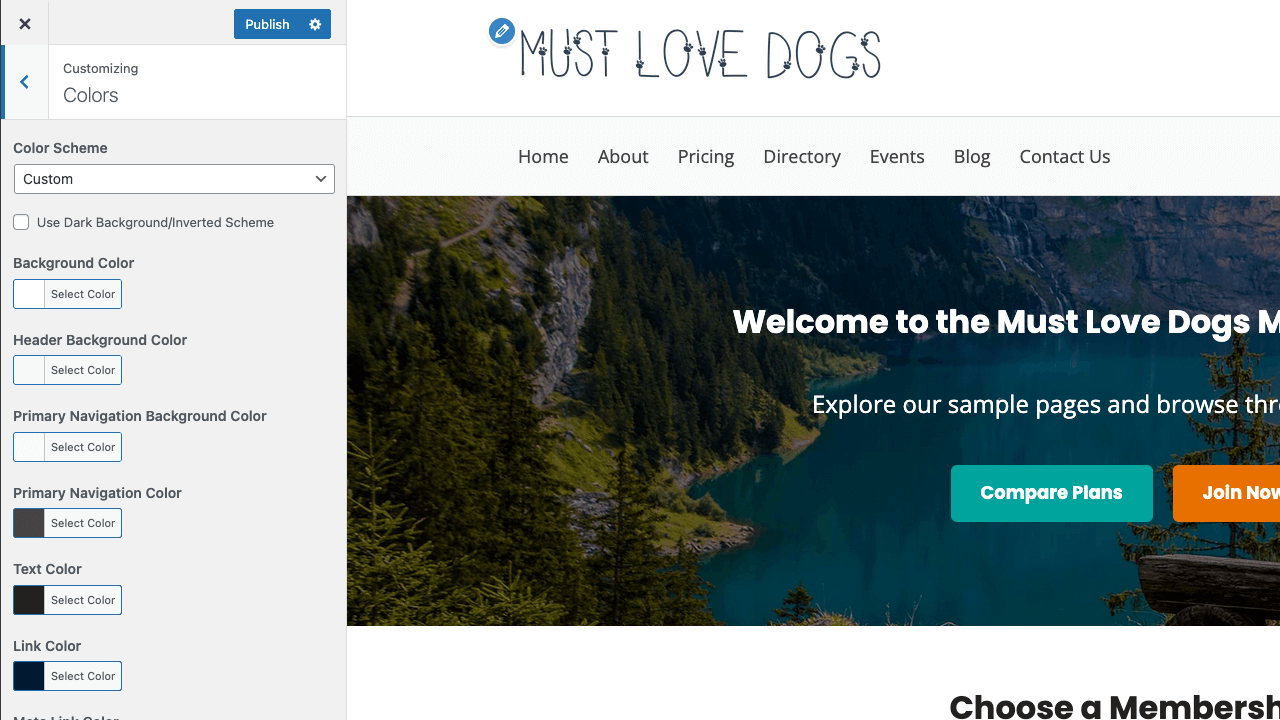
Easily select a built-in Color Scheme or change the site’s color scheme manually by modifying the colors under Appearance > Customize > Colors.
Table of contents
Update Theme Colors
- Navigate to Appearance > Customize > Colors.
- Select a color to modify. Options include:
- Site Title and Tagline color
- Background Color
- Header Background Color
- Primary Navigation Background Color
- Primary Navigation Color
- Text Color
- Link Color
- Meta Link Color
- Primary Color: Used for the main page title banner and headings.
- Secondary Color: Used as the background of the Login/Members Menu area and bottom banner on pages (when defined).
- Action Color: Used for speciality/highlight links. Also used for CTAs.
- Default Button Color
- Page Masthead Background Color
- Page Masthead Text Color
- Footer Widgets Background Color
- Footer Widgets Text Color
- Click the “Select Color” to bring up a color picker where you can select a color or enter a hexadecimal color value.
Memberlite Color Schemes
These default color scheme options can be selected under Appearance > Customize > Colors.
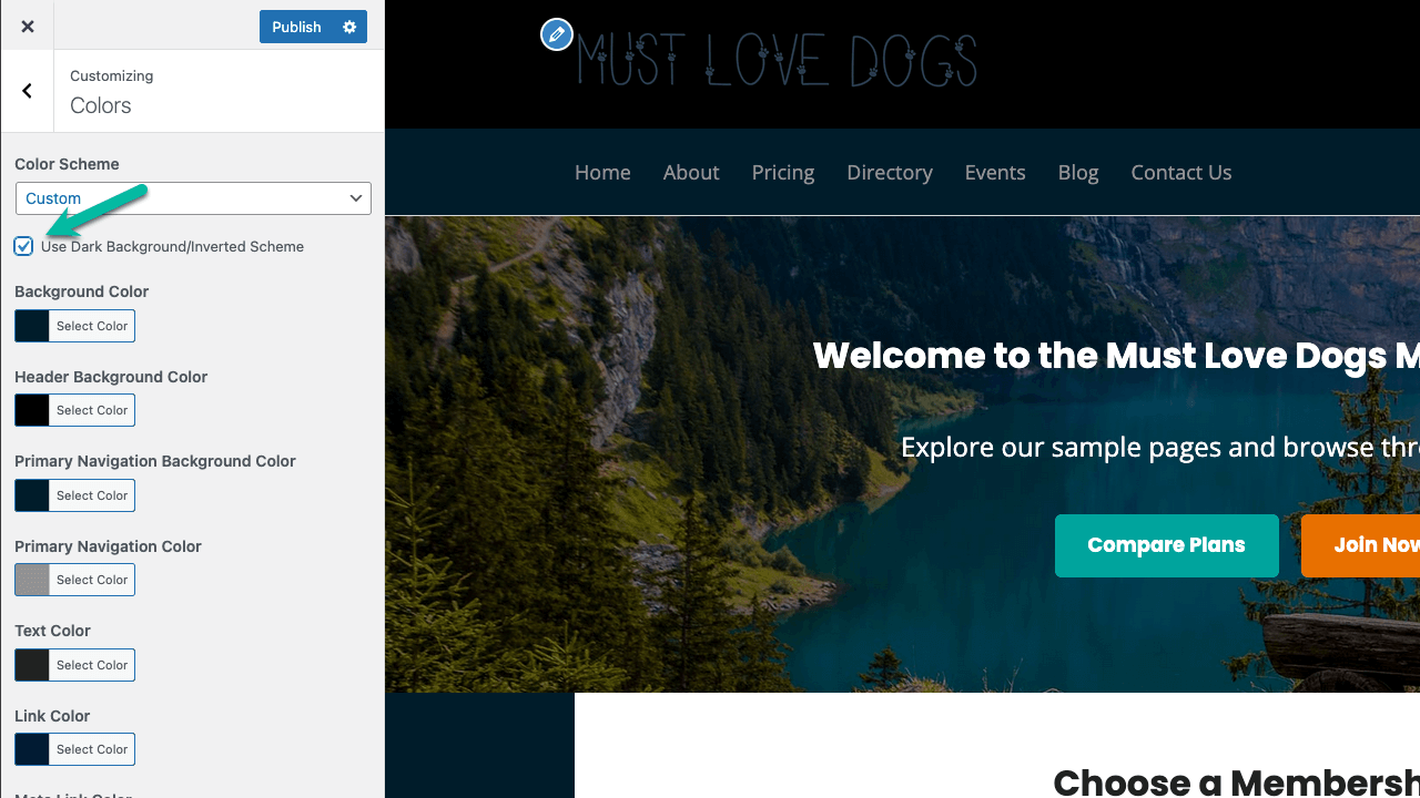
Use a Dark Background
If you would like to use a dark background color (inverted scheme with white body text), check the setting Use Dark Background/Inverted Scheme. This will update text colors and white/grey background elements to better complement your dark background.
Get Support From Our Team of Experts
For more help with this PMPro feature, check out our Support Page with three ways to get support as a free or premium member.
Last updated on December 22, 2025
Was this article helpful?
YesNo