Unlocking the potential of a successful membership site requires more than just compelling content—it demands a thoughtful and strategic approach to user experience.
When carefully crafted, your membership site becomes more than just another website. It evolves into a thriving environment where members find value, engage actively, and build lasting relationships.
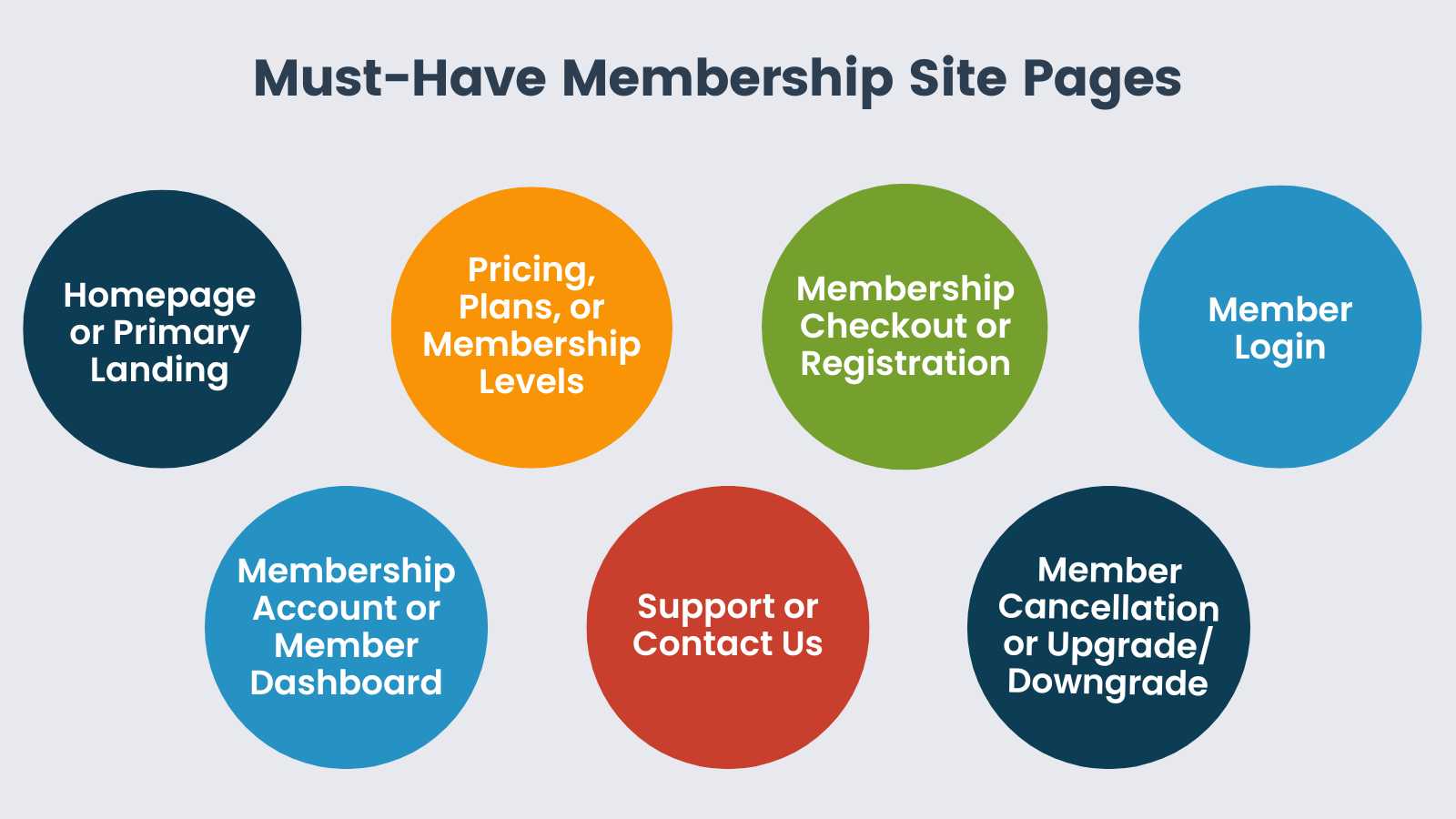
In this guide, we dive into the 7 essential pages that anchor a successful membership site:
- Explore the core pages that shape a potential member’s journey, from the initial introduction on the homepage to the decisive moment on the checkout page.
- For current members, we emphasize the importance of user-friendly dashboards, seamless login processes, and easy-to-navigate support and cancellation pages.
- Finally, this guide explores the specialized pages you may need based on your specific niche.
This guide is designed to give you a blueprint for building a successful membership site that not only attracts new members, but also retains and nurtures its existing base.
Table of contents
- 1. Homepage or Primary Landing Page
- 2. Pricing and Plans: Your Membership Levels Page
- 3. Membership Checkout and Registration Page
- 4. Member Log In Page
- 5. Membership Account or Member Dashboard Page
- 6. Support or Contact Us Page
- 7. Member Cancellation or Upgrade and Downgrade Page
- Recommended Pages for Specific Membership Use Cases and Niches
- Create the Framework For a Successful Membership
Must-Have Pages For Any Membership Website
The right pages are crucial for defining your site’s identity and ensuring effective member interactions. Whether you’re starting a new membership site or improving an existing one, understanding these essential pages is key to succeeding in the competitive online membership market.
1. Homepage or Primary Landing Page
Your homepage, often the first touchpoint for visitors, is akin to a digital handshake. Done right, makes a lasting impression that drives membership conversions.
Effective homepages quickly and clearly present the core value of your membership, while enticing visitors to explore further. The objective of this page is to introduce your membership site and capture interest within the first few seconds or scrolls.
Key Components of the Homepage
- Immediately Clear Value Proposition: Clearly articulate the core benefits of joining your membership site.
- Engaging Design: Use visual elements and layouts that resonate with your target audience and elevate your site’s value proposition.
- Clear Call to Action (CTA): Prompt visitors to take the next step, whether that’s signing up, exploring membership tiers, or reading more about the community. In most cases, your homepage has a single purpose: get potential members to click to see your plans. Don’t confuse this page with multiple CTAs.
- Brief Testimonials: Showcase member feedback to build trust and display the tangible benefits of joining.
- Quick Navigation: Ensure easy access to essential pages or sections, such as Pricing/Plans, About, and Contact.

Tools Help Your Build Your Site’s Primary Landing Page
When crafting the optimal landing page experience, consider these tools and strategies:
- Page Builders: Use the WordPress Block Editor, Elementor or Divi for an intuitive experience, allowing for full customization. Check out our PMPro demo sites and see how we built a landing page that converts using only core WordPress tools. Or browse documentation on PMPro’s Page Builder Compaitibility.
- WordPress Themes: Choose a theme tailored for membership sites to ensure the theme’s built-in features align with your needs. Often your theme will have one or more demo sites that can serve as inspiration for your site’s homepage layout.
- WordPress Plugins: Use plugins that enhance the user experience, from interactive testimonials post types, blog article feeds, icon libraries, and more.
- Engaging Media: Integrate high-quality photos, illustrations, and videos to convey your membership’s value in a visual way.
- Optimization Tools: When you’re really looking to optimize, consider a service like Hotjar to monitor user behavior.
Remember, Your Homepage Serves Two Distinct Audiences: Potential Members and Current Members
Your homepage has to balance the needs of both potential members and current members. This means you need to create dynamic homepage content based on the user’s status. Here’s a quick summary of how to achieve this dual purpose:
A Sales Tool: Your Homepage for Potential Members
For users who aren’t logged in—essentially potential members—the homepage is a sales and marketing tool.
Your page design and content are geared towards introducing, enticing, and converting these visitors into members. These are your goals for potential members:
- Capture Attention Quickly: The design and messaging should grab the visitor’s interest in the first few seconds.
- Communicate Value Proposition: Clearly outline the benefits of joining. Highlight what sets the membership apart.
- Build Trust: Feature testimonials, endorsements, or case studies to reduce skepticism.
- Provide Clear Calls to Action (CTA): Drive visitors towards conversion actions, like a free sign up, taking a trial, or exploring membership tiers.
- Answer Key Questions: Address FAQs about the membership, fees, and benefits.
A Member Portal: Your Homepage for Logged-In Members
For users who are already members and logged in, the homepage takes on a different role.
It acts as a member portal, an entry point to access the resources, content, or community they’ve subscribed to. These are your goals for logged-in members:
- Easy Navigation: Members should be able to easily find and access the content they’re looking for.
- Personalization: Offer personalized recommendations or updates based on the member’s preferences or activity. Tip: try using the PMPro Member Info shortcode to personalize content.
- Community Engagement: Highlight upcoming events or trending discussions to foster participation and connection.
- Access to Account Management: Provide links or shortcuts to manage their profile, subscription, or billing details. This can be included in a conditional menu area using our Nav Menus Add On.
- Continuous Value: Regularly update content, offers, or features to keep members engaged. Highlight the ongoing value of a subscription to help reduce churn.
Balancing Both Objectives
Successfully balancing the needs of both user types often involves dynamic homepage content based on the user’s status. There are a few ways to do this with Paid Memberships Pro:
- Consider the Member Homepages Add On as a way to make this a more straightforward setup process.
- Use the Membership Required Block or membership shortcode for dynamic content display. When a user visits your site, the homepage detects their status and displays content accordingly.
- Potential members see sales-oriented content.
- Logged-in members are greeted with a dashboard-style layout tailored to their needs.
Try to include both common and dedicated sections to make life easy on yourself. Part of the homepage could remain static, catering to potential members, but once logged in, the majority of visible content shifts to serve the member’s needs.
Your homepage is the member’s initial encounter with your brand. Make sure it sets the tone for what lies within.
2. Pricing and Plans: Your Membership Levels Page
Successful subscription businesses know that the Membership Levels or Pricing and Plans page is deeply important—probably the most important page in your membership site.
It’s not just about listing prices; it’s about offering clarity, building trust, and facilitating a smooth journey for potential members from browsing to buying.
When executed well, this page can significantly impact your conversion rate and member satisfaction.
The objective of your pricing page is to clearly present membership tiers, their features, and costs, with a direct link to complete checkout in a single step.
Key Elements of a Successful Membership Pricing Page
Here’s a breakdown of the elements that make this page both functional and effective:
- List of Membership Tiers: Display all available membership levels.
- Detailed Features: Provide a clear breakdown of what each tier offers.
- Pricing: Clearly indicate the cost associated with each tier.
- Transparency: Ensure potential members understand the value of each tier.
- Direct Checkout Links: Embed links to the checkout process for each membership level for ease of transition.
- Simplicity: Prioritize a straightforward design to enhance conversion rates.
How to Design Your Pricing and Plans Page
To design a successful membership site’s pricing page, try some of these ideas:
- Built-in Levels Page in PMPro: Start with the standard Membership Levels shortcode or block from Paid Memberships Pro.
- Advanced Levels Shortcode Add On: If you seek greater flexibility, opt for the Advanced Levels Shortcode Add On. This plugin offers column, block, and compare table layouts for your pricing plans.
- WordPress Block Editor: Use the Checkout Button Block and your favorite Block Editor tools like groups, stacks, rows, and columns, to design the pricing page. Or, use the button block to design custom buttons that directly link to the checkout.
- Page Builders: Tools like Elementor or Divi offer a hands-on, visual approach to design, ideal for those keen on a personalized layout.
- Third-Party Pricing Plugins: Consider plugins like Easy Pricing Tables by Fatcat Apps for specialized, feature-rich pricing tables.
By marrying your objectives with these powerful tools, you can craft a pricing page that informs and drives member conversions.
3. Membership Checkout and Registration Page
Directly following your pricing page, the Membership Checkout or Member Registration Page is the second most important page of your site.
This is the primary place where potential members convert their interest into actual membership commitment.
The objective of your checkout page is to efficiently gather member details and facilitate a smooth registration process.
Key Components of the Membership Checkout Page
- Streamlined Form Fields: Use well organized form fields that securely capture only the most essential information for member signup.
- PMPro captures several required fields to create the user and accept payment in a single form.
- You can use the methods outlined in this companion guide on checkout optimization to further streamline this page.
- Payment Options: Offer the payment methods that make the most sense based on your requirements and region.
- Refer to the full list of payment gateways for PMPro to explore options like PayPal, Stripe, Apple Pay, Google Pay, Pay by Check, and Buy Now/Pay Later.
- Transparency: Clearly communicate any terms, conditions, or policies associated with membership.
- With PMPro, you can require a terms of service agreement at checkout if you choose.
- User Experience: Ensure the page is clean, minimizing hurdles to member registration.
- Some websites hide the primary navigation bar and other wrapping elements, like the site footer, to bring more focus to their checkout experience.
By designing this page with precision and clarity, you not only streamline the registration process but also lay the foundation for a positive, long-term member relationship.
4. Member Log In Page
For membership sites, easy access combined with secure user data is crucial. The dedicated Member Log In Page is more than just an entry point: it shows your focus on convenience and security.
Balancing a simple user experience with strong security protects your site and boosts member trust. The goals of this page is to offer a secure login experience for all members and users.
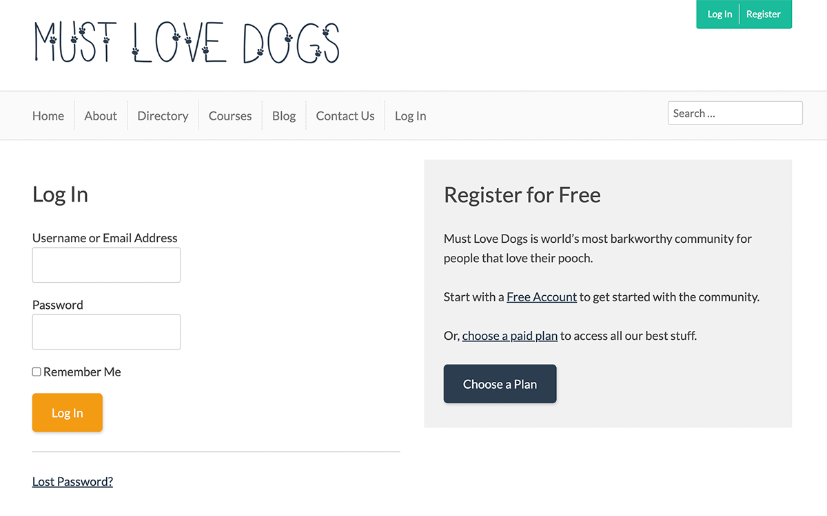
Key Components of the Member Log In Page
- User-Friendly Interface: Provide an intuitive login process for all members. We recommend minimizing distractions on this page, but you can consider adding a link to register or view plans. This supports the case when a visitor arrives on this page and isn’t already a member.
- Offer Password Reset: Like everyone online today, your users are juggling way too many logins across all the sites and apps we use. Make sure your login page has a clear way to kick off the password reset process.
- Enhanced Security: Part of both your checkout page and the password reset process, consider a tool like PMPro’s Require Strong Passwords Add On to encourage members to use more hardy passwords.
Taking time to optimize your login experience ensures that every member can log in, regardless of their technical skills. This not only reduces customer support emails for your team, but gives your members more autonomy in accessing their exclusive content.
5. Membership Account or Member Dashboard Page
Once logged in, members land on their personalized Membership Account page or Member Dashboard. This centralized space is a one-stop access point for all member-related data and actions.
The objective of the account or dashboard is to provide members with a clear, user-friendly interface to view and manage their membership details.
Key Components of the Membership Account Page
- Membership Details: Clearly display the member’s current membership level, payment plan, and links common actions like updating billing method or account cancellation.
- Overview and Access to Membership Benefits: Display the perks and advantages tied to their membership level. Make it super easy for members to jump into the value of their subscription, be it members-only blog posts, directories, forums, downloads, events, and more.
- Invoice and Billing History: Offer a clear view of invoices paid with billing details and history.
- Dynamic Profiles: Enable members to view current profile information and provide a link to update personal information via the member profile edit page in PMPro.
Remember that the Member Account page serves as a central hub, empowering members to have control over their details and how to engage. Use this page to give members autonomy, enhance user satisfaction, and ensure a deeply cohesive membership experience.
6. Support or Contact Us Page
Regardless of the type of membership site you run, members and even potential members should have a clear way to reach you.
- Members will be contacting you about account-related questions.
- Site visitors may need to reach out with a question about your plans.
- A potential partner may want to contact you for a new marketing endeavor.
Make sure your contact or support page is easy to access and simple to use. Don’t be the site that hides their actual contact method behind endless links to FAQs and self-service links.
Beyond the functional role, a contact or support page affirms your commitment to member satisfaction. This page assures potential members and paying members that no matter the question, no matter the concern, members can trust you to be there.
The contact page is a cornerstone of your customer success strategy, reaffirming your dedication to member success.
7. Member Cancellation or Upgrade and Downgrade Page
The cancel page respects the autonomy of your members and gives them the freedom to make decisions about their membership. Your Membership Cancel page should offer a straightforward way for a user to terminate their membership.
While some sites use dark patterns that make cancellation nearly impossible, at PMPro we encourage you to focus on the customers that want to pay you.
- Do you really want to trick an unhappy customer into sticking around?
- Or keep someone’s money after they just got annoyed and put off cancellation until next month?
- Make the cancellation process simple.
This includes the option to either switch to a different level or to opt for cancellation altogether, should the need arise.
Cancellation Page for Locked Memberships
We want to acknowledge that sometimes there are real scenarios where members are locked into a particular level. In such cases, your membership cancel page takes on a crucial role.
- Make sure this page communicates the reasons behind the membership lock and provides a way for members to reach out to you for clarification.
- Keep the communication lines open and allow members to resolve issues in a way that respects their needs and the site’s policies.
While no one wants to lose members, a clear cancellation process underlines your commitment to fostering a membership experience that’s founded on respect, transparency, and understanding, ensuring that every member’s journey is honored.
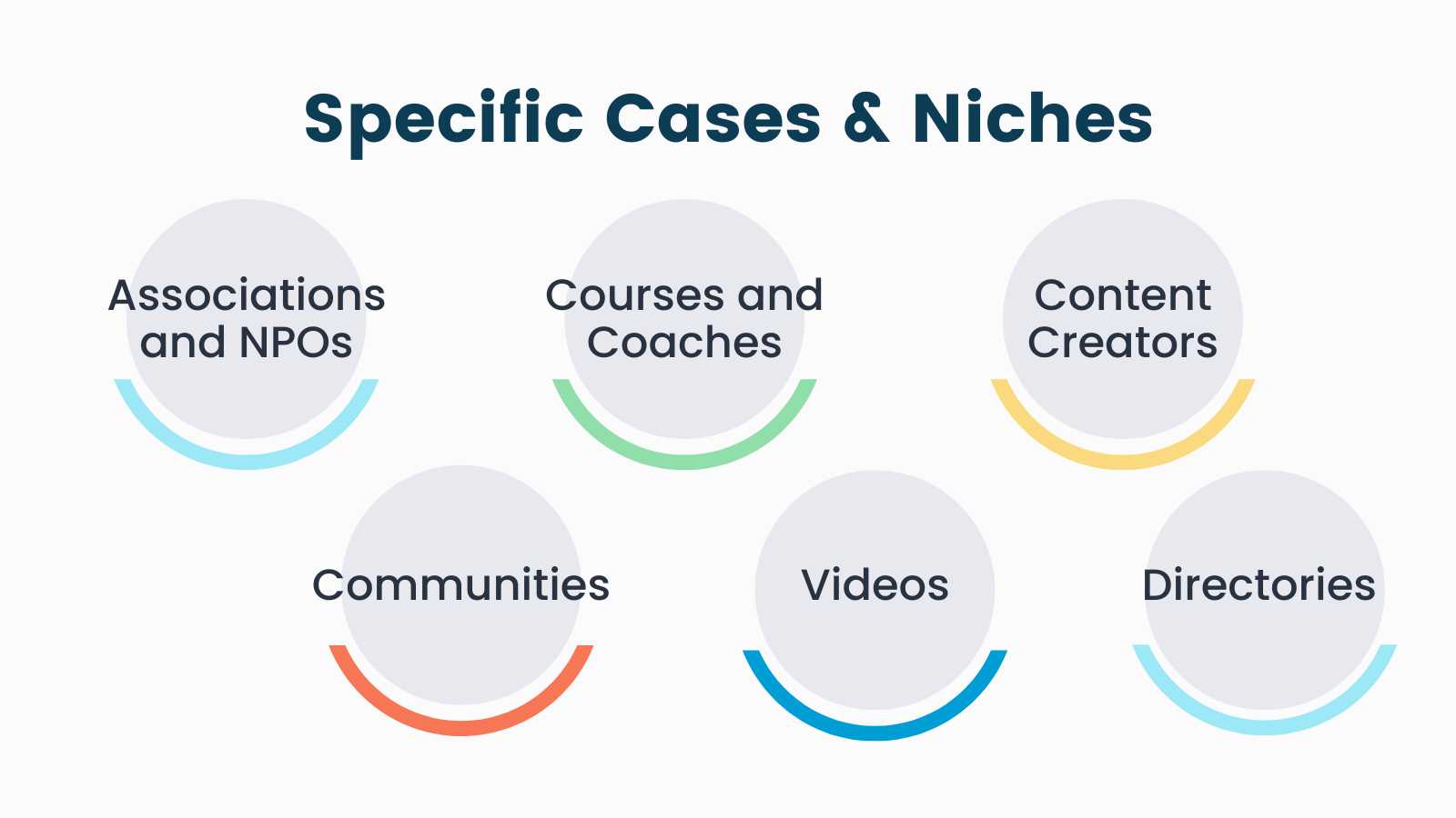
Recommended Pages for Specific Membership Use Cases and Niches
Different membership niches have unique requirements. Consider which pages are needed for your site type to address member needs more effectively.
Whether you’re venturing into selling courses or coaching, or adding a private video area to your current site, these recommended pages guide you in achieving a tailored and efficient user experience.
Associations and NPOs
Numerous associations find value in showcasing a member directory—which you can add using the Member Directory and Profile Pages Add On. Associations often offer a dedicated space for members-only events, too.
Courses and Coaches
Memberships that offer courses need a Course Catalog that services as a dedicated page to list all available courses.
In addition, it’s important that your members can easily view their enrolled courses and progress. When you streamline the integration between PMPro and LifterLMS, your students gain access to a personal Student Dashboard. This screen allows students to resume in-progress courses, view quiz or assignment results, and access certificates or other notifications.
Content Creators: Blog and News Sites
For a website centered around content creation and delivery, a key requirement is a page that archives all published posts and articles.
This collection must also incorporate user-friendly filtering options, allowing members to seamlessly navigate and access the content that aligns with their interests.
Communities
When fostering a community focused membership site, it’s important to provide an areas where members can connect with one another. Some options include the forums homepage, an activity feed, or a community directory.
We also recommend that you expand your Membership Account page to include links and feeds with recent conversations or replies. This can be done natively on your site using the BuddyPress integration for PMPro, or externally using an integration like Discord.
Videos
A membership site with a video-centric approach often seeks a dedicated video library page. Leverage the capabilities of the Vimeography plugin to construct a searchable video gallery, granting members easy access to a curated collection of videos.
Directories
Directory-based membership sites need a page that lists all directory listings, as well as tools to filter results and allow members to edit their public profile.
For sites with a primary focus on directories, it’s crucial to establish your goals for public and private directory pages. Decide whether you want to make this directory page and individual profiles available to the public or for members-only.
Create the Framework For a Successful Membership
The framework of a successful membership site is rooted in the essential pages covered in this guide. These 7 must-have components are the cornerstone of a thriving membership business.
Key Sales Funnel Pages
Success begins with a focus on your website’s sales funnel: the experience of easily navigating from the homepage or landing page, to the pricing page, and finally completing registration.
These pages fulfill a critical role in shaping the user journey and, ultimately, your membership site’s success.
Key Membership Retention Pages
After signup, retention becomes the key focus for a successful membership site experience.
- Consider every page needed to support members in accessing their account, invoice history, managing profile details, and more.
- Review the kind of membership site you’re building and what additional pages your members need to find value in their subscription.
Prioritize User Experience
Take care to create membership pages that are user-friendly, transparent, and adaptable. Test your site against accessibility standards using a tool like the WAVE web accessibility evaluation tool. Once your core pages are in place, the next step is refining each one so it feels built for the people paying you. See 10 Ways to Enhance Your Member Experience for specific ideas.
By doing so, you not only cultivate a positive experience for your members, but also nurture a strong commitment to your membership site. This commitment, in turn, fuels active engagement and sustained participation within your vibrant membership.
Remember that the architecture of your membership site is more than a collection of web pages—it’s a dynamic ecosystem where value is exchanged, relationships are forged, and growth is nurtured.
Ready to transform your vision into reality? Start crafting your membership site today and witness the power of these essential pages firsthand.
Free Download: The AI-Powered Membership Site Blueprint
Download the free guide: Learn how to plan, build, and grow a membership site using AI as your strategic partner: from buyer persona to launch and beyond.