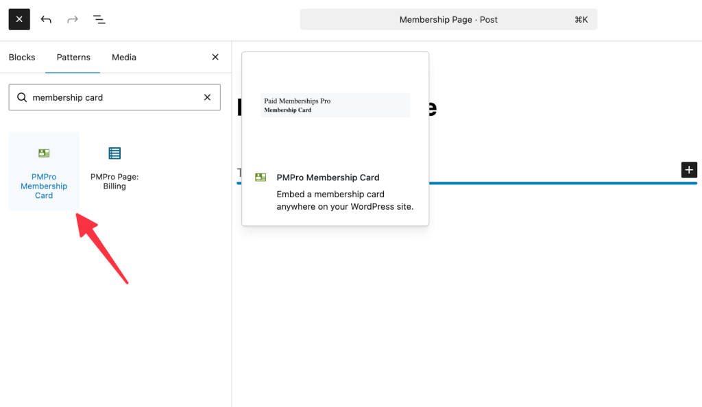
The Membership Card Add On v2.0 introduces a dedicated block for those using the Block Editor. Use the steps below to customize your Membership Card using the block settings:
- Navigate to the page where you want the card to appear and click Edit.
- Click the + (Plus) button to add a new block and search for “Membership Card”.
- Click on the block to insert it on the page.
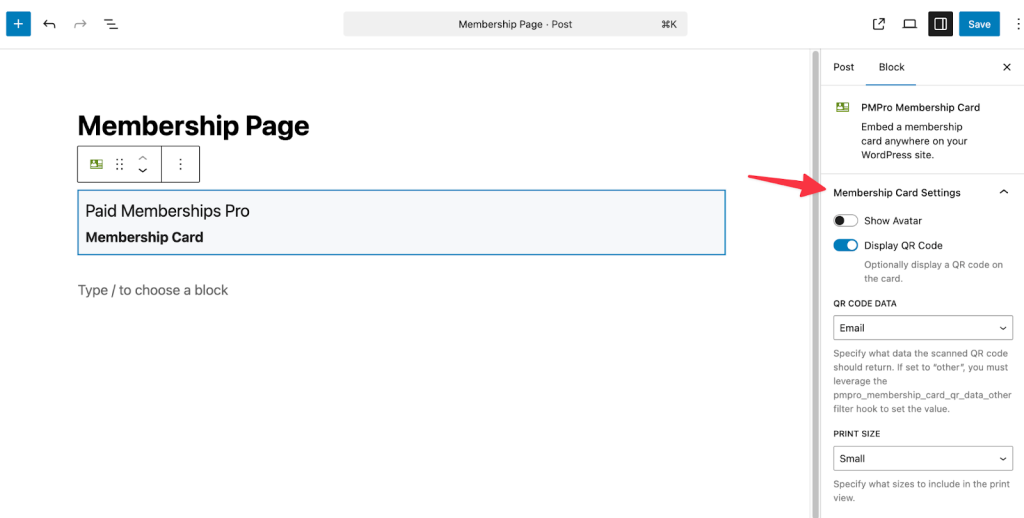
- Once you have added the Membership Card block to your page, look at the Block Settings in the right-hand sidebar of the WordPress editor. These options allow you to toggle specific features on or off and control the data included in the card.
- Show Avatar: This toggle controls whether the member’s profile picture (Gravatar or uploaded avatar) appears on the card. You can enable this for physical identification cards, such as gym access cards, library cards, or event badges, where visual verification is required.
- Display QR Code: You can switch this on to automatically generate a unique QR code for the member. This is useful for organizations that use scanning apps for member check-ins or attendance tracking.
- QR Code Data: If the QR code is enabled, you can decide what data is embedded inside the code when scanned. You can choose from the following default options:
- ID: Returns the WordPress User ID.
- Email: Returns the member’s email address.
- Level: Returns the ID(s) of the active membership level(s) (comma-separated if multiple).
- Other: Select this if you wish to pass custom data (see the Developer Note below regarding the
pmpro_membership_card_qr_data_other filter).
- Print Size: This setting defines the default card size when the user clicks the “Print” button. You can restrict printing to specific sizes (Small, Medium, Large) or allow “All” so the user can choose their preferred size.
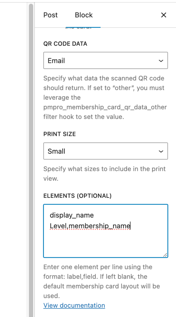
Customizing Card Content via The “Elements” Field
The Elements text area provides granular control over which text and data appear on the card. You can use it to structure the layout of your card’s information by entering one item per line.
Most items use the format Label,field_key. The “Label” is the text displayed on the card (e.g., “Member Name”), and the “field_key” is the data pulled from the database (e.g., display_name).
Available Element Fields
You can display standard user data or custom fields on your card. Here are the predefined elements you can use:
- site_logo → Displays the site logo (No label required).
- featured_image → Displays the featured image of the post/page (No label required).
- display_name → The member’s WordPress display name.
- membership_name → The name of the member’s active level(s).
- membership_startdate → The date the user joined.
- membership_enddate → The date the membership expires.
- pmpro_shipping_address/pmpro_mailing_address -> The member’s shipping/mailing Address. These are interchangeable.
- user_email → The member’s email address.
- user_login → The member’s username.
Note: Any other elements will try to automatically get the user_meta and assume it’s the user meta key.
For custom user fields, use the field’s name. For example, Company Name,company where “company” is the field’s name which the User Fields settings.
Example:
Below is a screenshot of the Block Editor highlighting how the elements are listed.
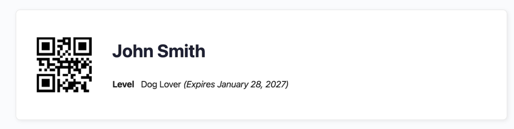
The above settings will show the following membership card.
Get Support From Our Team of Experts
Have a question about how to use this feature? Our Support Page outlines three ways to get support.
Our Max plans include hands-on help customizing your membership site and implementing new features. Upgrade to PMPro Max now »
Last updated on March 6, 2026