Memberlite adds gradient presets and background textures to the block editor. Both are drawn from your color scheme, so a section you design today still looks right if you switch schemes or change a color later.
Gradient Presets
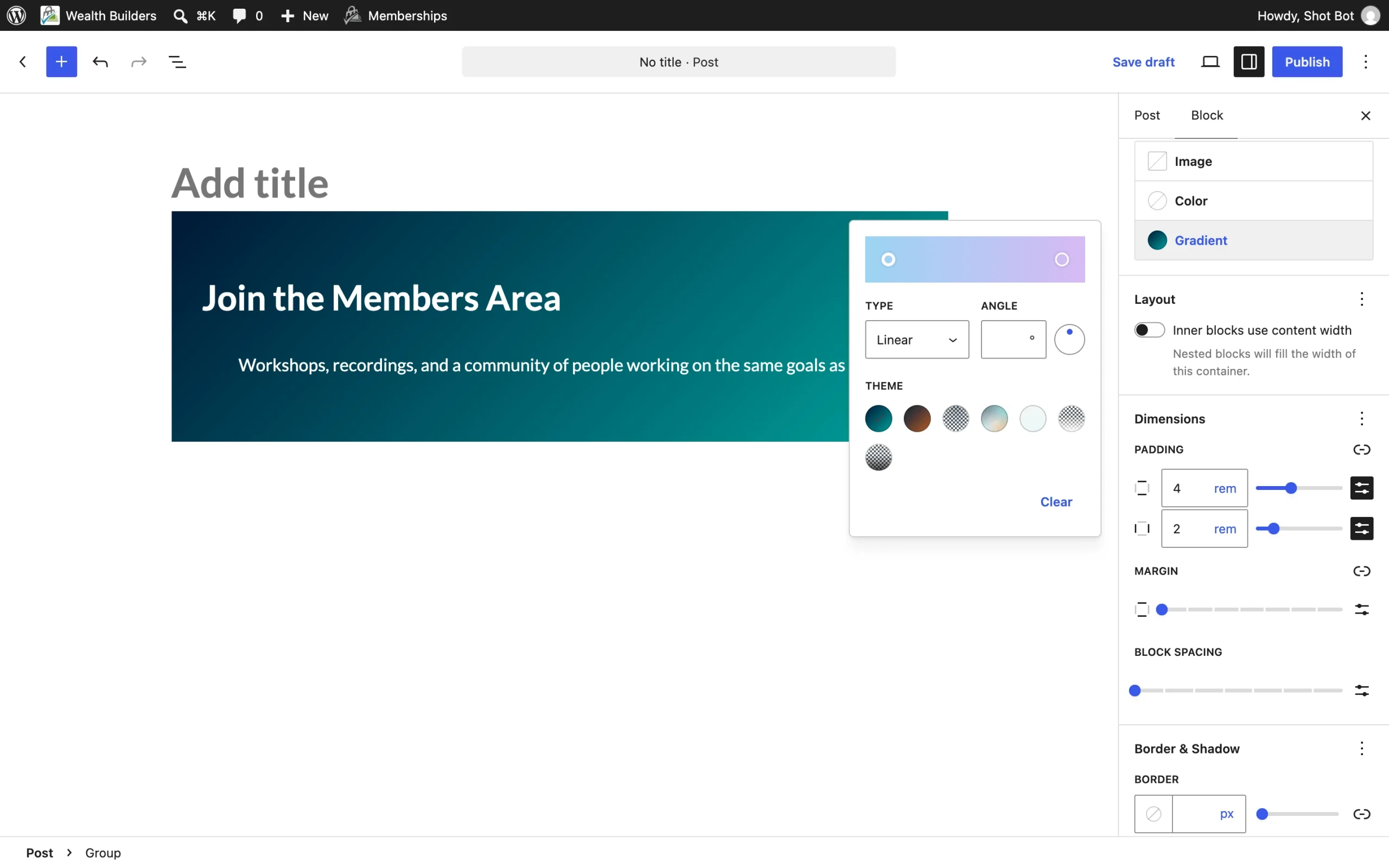
Memberlite includes seven gradient presets. They replace the WordPress default gradients in the block editor’s gradient picker. Blocks that already use a WordPress default gradient keep it.
| Gradient | Use It For |
|---|---|
| Primary to Secondary | Bold brand sections and call to action bands. Use white text. |
| Primary to Action | High-energy calls to action and promo banners. Use white text. |
| Primary Glow | A spotlight of your primary color at the top of a section that fades out below it. |
| Mesh | Soft, multi-color backgrounds for heroes and feature sections. |
| Soft Wash | A light tint across a whole section to set it apart from the page. |
| Fade to Background | Over a background image, blends the bottom of the section into the page. |
| Bottom Scrim | Over a photo, darkens the bottom so light text stays readable. |
Because the gradients use your scheme’s primary, secondary, action, and background colors, they update when you change your color scheme in Appearance > Customize > Colors. Read more in Colors and Typography.
How to Apply a Gradient
- Select a block that supports a background, such as a Group, Columns, or Cover block.
- In the Settings sidebar, open the Styles tab.
- In the Background panel, click Gradient.
- Click a Memberlite gradient to apply it.
On a Cover block, the gradient is the overlay on top of the image. Set the overlay opacity to 100 so the gradient shows at full strength; Fade to Background and Bottom Scrim are already partly transparent.
Background Textures
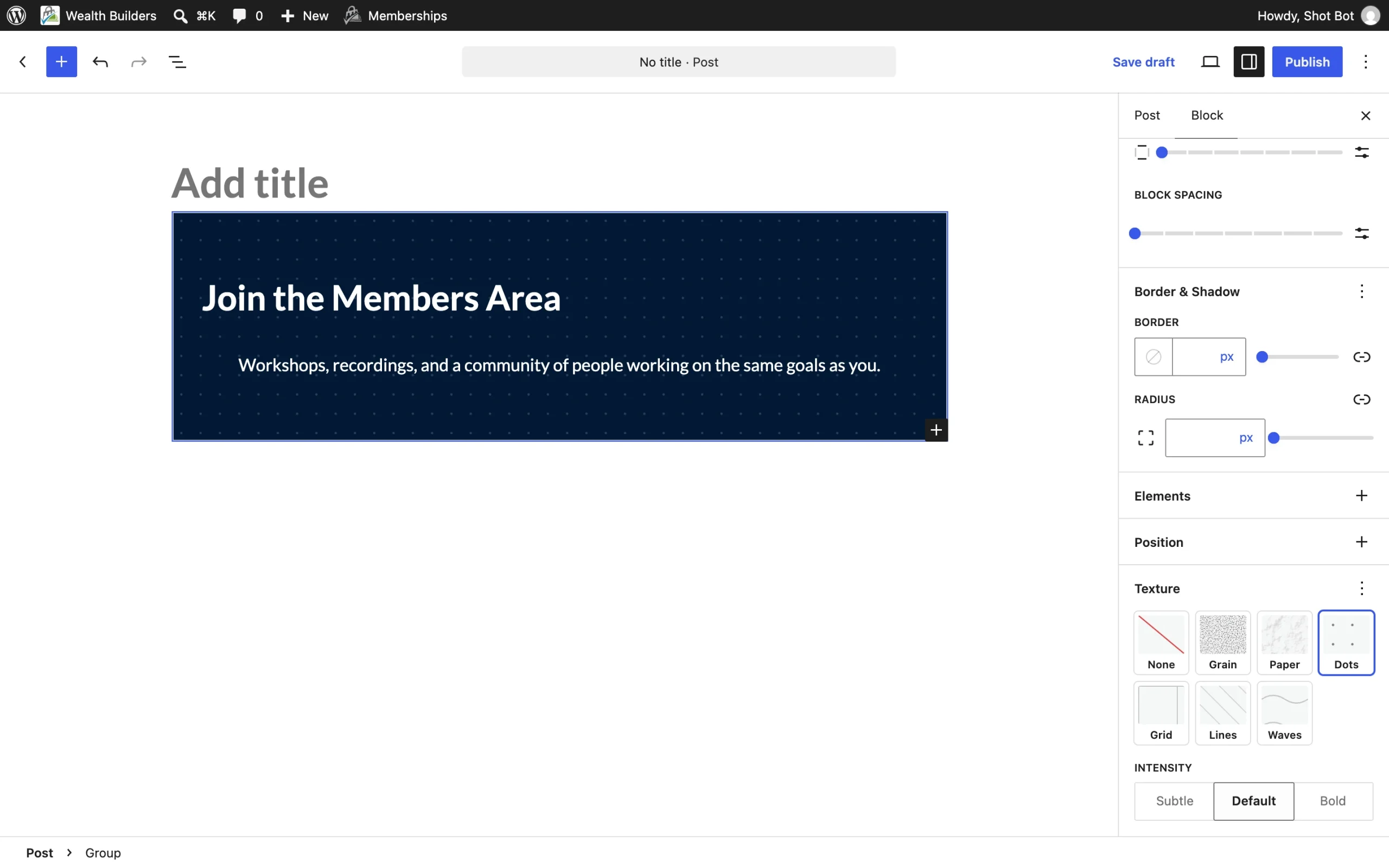
Textures are subtle patterns drawn over a block’s background. You can add one to a Group, Columns, Column, or Cover block.
| Texture | Look | Good For |
|---|---|---|
| Grain | Fine film grain | Adding depth to flat colors and gradients. Works almost anywhere. |
| Paper | Soft paper surface | Editorial, nonprofit, education, and personal brands. Best on light backgrounds. |
| Dots | Dot grid | Feature and call to action sections. |
| Grid | Fine square grid | Organized, professional, or technical sections. |
| Lines | Diagonal lines | Accent bands and dark sections. |
| Waves | Rows of soft waves | The most decorative option. Best for playful brands. |
How to Add a Texture
- Select a Group, Columns, Column, or Cover block.
- In the Settings sidebar, open the Styles tab.
- In the Texture panel, click a texture swatch. Click None to remove it.
Texture Intensity
After you pick a texture, an Intensity setting appears in the same panel. Choose Subtle, Default, or Bold. Use Subtle over photos and busy layouts, and save Bold for large, plain sections.
Tips for Using Textures
- Textures are drawn in the block’s text color, so they work on light and dark backgrounds. Change the text color and the texture follows.
- Textures are automatically lighter on dark sections, and quieter on Cover blocks and blocks using the Card style, so your content stays readable.
- Textures combine with background colors, gradients, background images, and block styles like Card and the slanted Group and Cover styles.
- On a Cover block, the texture sits above the image and overlay and below your content.
- Use one texture per block, and texture only a few sections on a page. Lines or Waves repeated across many sections can make a site look like a template.
Adding a Texture With a CSS Class
The Texture panel works by adding CSS classes to the block, so you can also add them yourself in the block’s Advanced > Additional CSS class(es) field. Add one texture class, plus an optional intensity class:
- Textures:
memberlite-texture-grain,memberlite-texture-paper,memberlite-texture-dots,memberlite-texture-grid,memberlite-texture-lines,memberlite-texture-waves - Intensity:
memberlite-texture-subtleormemberlite-texture-bold(leave it off for Default)
For example, memberlite-texture-dots memberlite-texture-subtle adds a light dot grid. In a child theme or custom CSS, you can set any strength with the --memberlite-texture-intensity custom property, where 1 is the default.
If you add a texture class by hand to a Cover block created in an older version of WordPress, open the page and save it in the block editor first so the Cover uses current markup. Otherwise the overlay and texture can draw in the same layer.
Get Support From Our Team of Experts
Have a question about how to use this feature? Our Support Page outlines three ways to get support.
Our Max plans include hands-on help customizing your membership site and implementing new features. Upgrade to PMPro Max now »
Last updated on November 12, 2026